1 - Getting Started ~5 mins
 Same words, four totally different designs. Today you will meet one short public message dressed four ways: a newspaper layout, a short social video, a primary-school poster, and a stark public notice. You will agree what to judge, weigh each design, and write a Design Choice Analysis for your Communication Portfolio (file it as m3_l70_design_choice_<your-initials>). If the period is short, finish the analysis for homework so the entry still lands.
2 - Four Designs, One Message ~8 mins
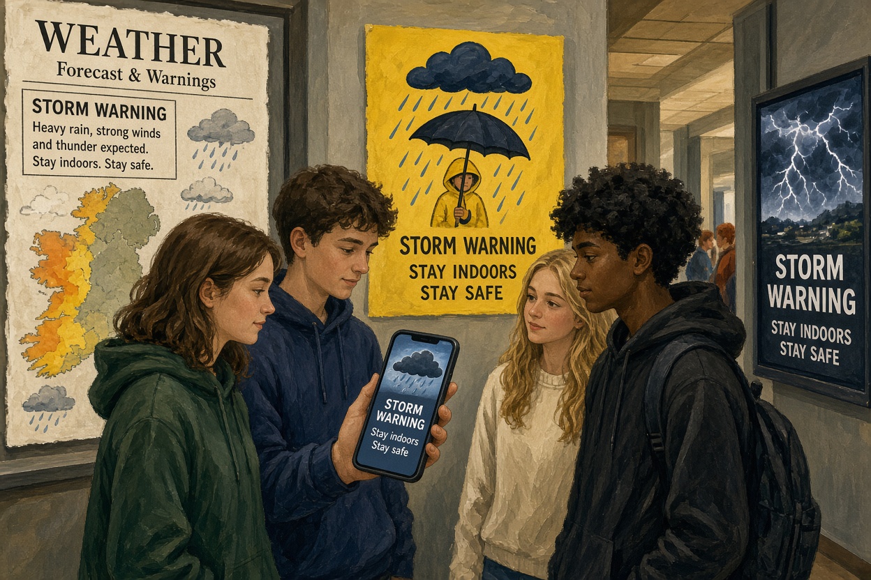 The shared message is: Storm warning. Stay indoors tonight.
These four versions were built for class: same words, different design jobs. Study each mock-up (on screen or on the printed sheet) before you judge colour, imagery, sound or type.
| Term | What it means for you | Real example |
|---|---|---|
| Typography | Name the type choices on each design and what they signal | Block capitals on a Garda-style notice vs soft rounded type on a kids' poster |
| Imagery | Say what each picture or graphic does to the reader | Cartoon umbrella on a kids' poster vs thin lightning silhouette on a public notice |
| Design choice | Your analysis will name at least three deliberate choices per design | Yellow/black urgent notice style vs soft pastels on a calm school poster |
Design A: broadsheet weather column. Dense grey body text under a black serif headline. Small monochrome weather map bottom right. No sound. Aimed at adults reading a morning paper.
Design B: short social video. Full-screen dark storm still. White bold sans-serif text flashes in three beats. Low wind roar under a slow pulse beat (sound is part of the design brief). Aimed at a phone feed at night.
Design C: primary-school corridor poster. Bright yellow ground, blue cartoon umbrella character, rounded friendly type, one clear sentence. Sound note on the mock: soft rain-patter under the image. Aimed at children aged 6–10.
Design D: monochrome public notice. Black field, white condensed capitals only, single thin lightning silhouette, no decoration. One short alarm tone, then silence. Aimed at any adult who needs the fact, fast.
3 - Agree the Criteria ~10 mins
Before you judge the four designs, lock the yardsticks you will use in the next step. Under each heading, add short criteria you can check on all four designs. Keep each criterion to a few clear words. These same five headings carry straight into the weigh.
What will we judge these designs on?
4 - Weigh Them ~15 mins
There is no single right winner, only a reasoned one.
Using the criteria you just agreed, write a short note in each cell from the four designs in front of you, then rate them and set how much each criterion matters. Watch the totals move when you change a weight.
Same warning, four designs
5 - Your Verdict ~17 mins
This is the piece that goes in your Communication Portfolio. Complete the Design Choice Analysis in the work box: at least three design choices and effects for each of the four designs, plus a short verdict (4–6 sentences) on which design works best for its own audience and why. Open with a short description of one design in words (text, graphics, colour, layout, sound if any, audience) in the style of an SEC written examination media-description question. Save the finished analysis as m3_l70_design_choice_<your-initials> in your Communication Portfolio folder.
Describe one design in words
Unlock the full learning experience
You're previewing this lesson. Get full access to this lesson and hundreds more — each one ready to teach, with interactive activities, printable resources and pupil progress tracking built in.
This lesson is copyright of 123Learn.ie 2017 - 2025. Unauthorised use, copying or distribution is not allowed.