Welcome
A document can say the right thing and still look untrustworthy if the formatting is messy. Today you tighten character and word formatting on a real project document: two fonts maximum, readable body size, and emphasis that earns its place.
Warm-up
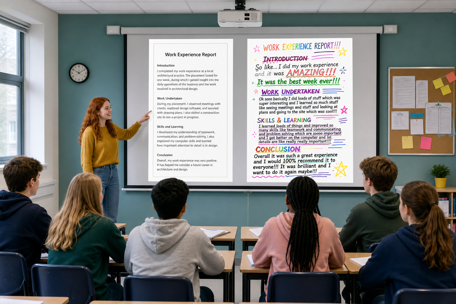 You are about to see the same short paragraph twice on the board: one version kept clean, one version overloaded with fonts, colours and underlines. Look at both and decide which one you would hand to a Work Experience supervisor or a local business contact, and put your hand up for it. Keep your reason in mind as you work, because you are aiming for that clean version all lesson.
These three rules keep a document readable for a busy adult reader: a supervisor, an examiner, a community contact, or a customer. You are not aiming for fancy — you are aiming for a page a busy adult can trust in ten seconds. Keep the clean target visible and match it.
Clean target (keep this visible while you work)
- Heading: Arial, 16 pt, bold, dark text
- Body: Georgia, 11 pt, regular
- Emphasis: bold on one short key phrase in the practice sample; on your own project, italic only if it helps the reader
- Colour: none in the body; strip underline from body text
Quick gloss: heading font (e.g. Arial) = plain letters without small feet, good for titles. Body font (e.g. Georgia) = small feet on the letters, often easier for longer reading. That is what people mean by sans-serif and serif.
| Concept | Why it matters | Example |
|---|---|---|
| Two-fonts-maximum — one heading font and one body font for the whole document | Extra fonts make a page look unfinished and pull attention from your message | Work Experience report: Arial headings + Georgia body looks calm; Comic Sans, Impact, and Calibri mixed in looks careless |
| Readable body size (10–12 pt) — body text easy to read on screen and on paper | Too small strains the reader; too large wastes space on a report or CV | 11 pt Georgia body for a community project proposal; leave 14–18 pt for headings only |
| Purposeful emphasis — bold, italic, underline, and colour each have a job | If everything is emphasised, nothing is. Readers stop trusting the cues | Bold the phrase a supervisor must notice ("two-week placement in May"); avoid underlining body text (it looks like a broken link) |
That clean target is what you build in the step-by-step task, then apply to your own project document.
Build a short, clean sample page using today's best-practice rules. Watch the pairing go on screen first, then follow the written platform steps for Word Online or Google Docs below rather than working from the paragraph on your own. This sample is practice only — it is not the banked portfolio file. Your real project document comes next in Independent Practice.
Folder check: open {{code:Project_Portfolio}} → {{code:09_specialism}} → {{code:sm1}}. Work in {{code:01_drafts}} inside {{code:sm1}} if you have that folder; if you only see files loose in {{code:sm1}}, work there — that is fine. If you cannot see {{code:sm1}} at all, tell your teacher before you click New.
If a font only changes on one word, you probably selected too little — select again and reapply; nothing is broken.
Sample text to use (type or paste this into your new document):
Match-day photo pitch
I offer club match-day photos for local GAA teams. Packages cover warm-up, key scores, and a short winner set delivered within 48 hours. Sample galleries are available on request for club secretaries planning the next championship weekend.
Pair check (about 2 minutes at the end): swap screens with a partner for about one minute each. Name one thing that follows the rules and one thing still noisy. Do not rewrite yet — deep fixes wait for Independent Practice.
Common Issues
| Issue | Solution |
|---|---|
| Only one word changed font, not the whole paragraph | Click and drag to select the full paragraph (or triple-click inside it), then choose the font again |
| I cannot find Georgia or Arial in the font list | Type the font name in the font box search. If a font is missing on a school machine, use the fallback pair Times New Roman (body) and Arial or Calibri (headings) |
| Bold or italic will not turn off | Select the text again and click the same {{btn:B}} or {{btn:I}} button once more, or press the same shortcut ({{kbd:Ctrl+B}} / {{kbd:Cmd+B}}, {{kbd:Ctrl+I}} / {{kbd:Cmd+I}}) |
| The heading and body still look the same size | Check the size box carefully: headings should read 16 (or similar), body 11. Click outside the text, then reselect and set size again if the box is blank |
| My document is full of colour and underlines from an old template | Select the noisy section, set font colour to automatic/black, and click underline off. Then re-apply only the two-font pairing and one or two purposeful emphasis marks |
Independent Practice
- Find the file. Open {{code:Project_Portfolio}}, then {{code:09_specialism}}, then {{code:sm1}}. Look in {{code:01_drafts}} first for {{code:sm1_doc1_from_template.docx}}; if you only see files loose in {{code:sm1}}, look there. Check {{code:03_finished}} only if needed.
- Make a v2 copy. Copy the file so you do not overwrite the original. Name the copy {{code:sm1_doc1_from_template_v2}} (Word Online keeps a Word file; Google Docs keeps a Doc — same name either way). Use the platform steps below for copy and rename.
- Path B (only if your file is missing or almost empty). Copy {{code:sm1_formatting_practice}} into {{code:sm1}} (or {{code:01_drafts}}), or make a new document and type the starter paragraph below. Still finish under the name {{code:sm1_doc1_from_template_v2}}. One heading plus one body paragraph brought to the clean target is enough for today's evidence.
Starter heading: Work Experience placement report
Starter body: I completed a two-week placement in May with a local business, working three days on the shop floor and two days in the office. My main tasks were checking stock deliveries, answering the counter phone, and updating the customer contact list. The skill I improved most was speaking to customers I had never met before, and my supervisor's written comments are available on request. - Apply the checklist with the same Home or toolbar font and {{btn:B}} / {{btn:I}} controls you used on the practice file. Work section by section.
- Select each heading: Arial, 16 pt, bold
- Select body text: Georgia, 11 pt (keep 10–12 pt if 11 looks tight)
- Strip extra colour and underline from body text
- Leave only 1–2 purposeful bold or italic marks on the whole page (italic is optional on your own project)
- Headings and body use at most two font families across the whole document
- Body text sits in a readable 10–12 pt range and looks even from top to bottom
- Body text is dark with underline off; colour only if a heading accent is already part of the template and still calm; at most 1–2 bold or italic marks on the page
- {{code:sm1_doc1_from_template_v2}} is saved inside your {{code:sm1}} Specialism folder (Word or Docs — matching name)
Unlock the full learning experience
You're previewing this lesson. Get full access to this lesson and hundreds more — each one ready to teach, with interactive activities, printable resources and pupil progress tracking built in.
This lesson is copyright of 123Learn.ie 2017 - 2025. Unauthorised use, copying or distribution is not allowed.